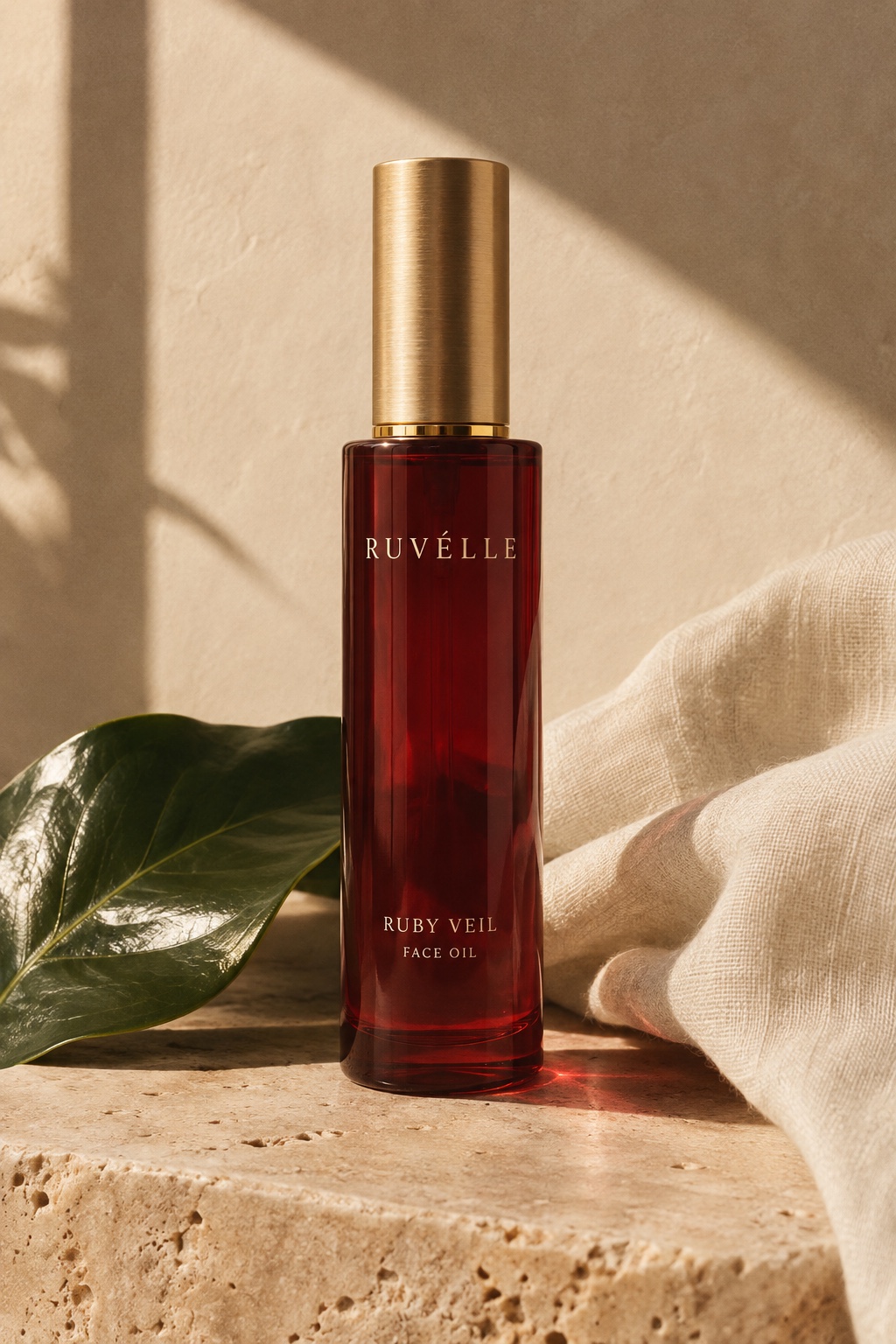
Ruby glass, botanical greens, and the soft warmth of gold. Three simple ideas, brought into conversation.
The first reference for Ruvélle was a tiny image: a red bottle, a golden cap, and green leaves. The label was unreadable, but the contrasts were clear. The design began with those contrasts rather than a borrowed identity.
A colour with depth.
Ruby red gives the bottle a visual weight that changes with the light. In the 3D experience, a deep burgundy silhouette turns luminous at its edges. It is a material study as much as a product study.
A different kind of shine.
The cap brings a quieter finish. Brushed gold catches a broad highlight, balancing the glass below it. A slender neck ring makes the transition between the two materials feel deliberate.
“A small object can hold an entire visual world.”
From still life to interaction.
The website lets you move beyond a product photograph. Turn the bottle. Lift its cap. Change the lighting. Botanical forms drift around the packaging, giving the still life another dimension.
Every element belongs to a fictional portfolio concept by Nexorge. The result is an exploration of how brand identity, editorial design, and interactive 3D can tell one coherent story.
Back to the journal ↗